

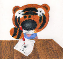
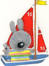
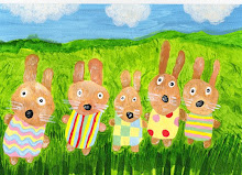
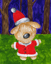
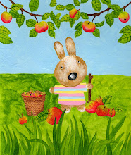
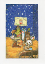
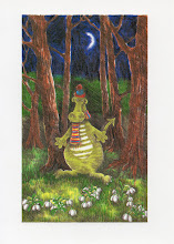
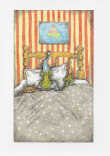
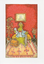
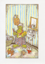
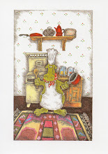
Hi Everyone, on a lovely Sunday afternoon. My Art Director has asked me to do some images for the card market which are less 'busy' and 'heavy'. I think I know what she means, as the Tiddles ones do have a lot going on - they are supposed to be like that though, as I want children to really have to look at the illustrations, and hopefully get some pleasure from 'discovering' little details..... I now need to change my style, somehow, to get the images more simple. Hmmm, it's harder than it sounds, as I have always sharpened my pencils into little pointy-points and hatched within an inch of my life! Here are some examples which I've done today - any advice anyone has would be welcome - I so want my work to sell, and it would awful if it didn't because it's too fiddly-widdly. (But that's how I work, kinda fiddly!) I have tried to make things a bit more simple, but still my work, if you know what I mean. Oh well, I'm off to get some chocolate then I'll have a bash at some more (if I don't eat too much chocky haha!)







5 comments:
or is less heavy and busy cheaper to produce?!!
I love your drawings because you put so much detail into them but I suppose there is no harm in trying a different tactic and see what happens. Judith
Thanks, Judith - I'm really glad you do, as they are what I do! I always get a bit upset when people say things like that, as I draw in this way, and feel it's kinda 'me'. But I do need to earn some money for this, that's for sure! So I better get on my illustration diet!! (Les heavy, haha)
I suppose it's about getting a balance between what's right for you and the market, but don't change your style too much or you won't be true to yourself or your characters.
Hope you enjoyed the chocolate and have a good week.
My personal opinion is that i love your detailled drawings, and as a kid, i always loved finding the hidden details...Jan Brett is one of my favorite children's book illustrators because she hides little scenes in the borders around the main story. And when i read books to kids, we always look for details that tell extra things about the story. For cards, though, you might want to have less background going on while keeping all your wonderful pencil shading on the characters that really give them dimension (in my 'umble opinion).
Thanks, Paula and everybody for your opinions - I'm really grateful, as it's hard to figure out by myself! (Cats are useless at crits!)I'll feedback any feedback when I get some
Post a Comment